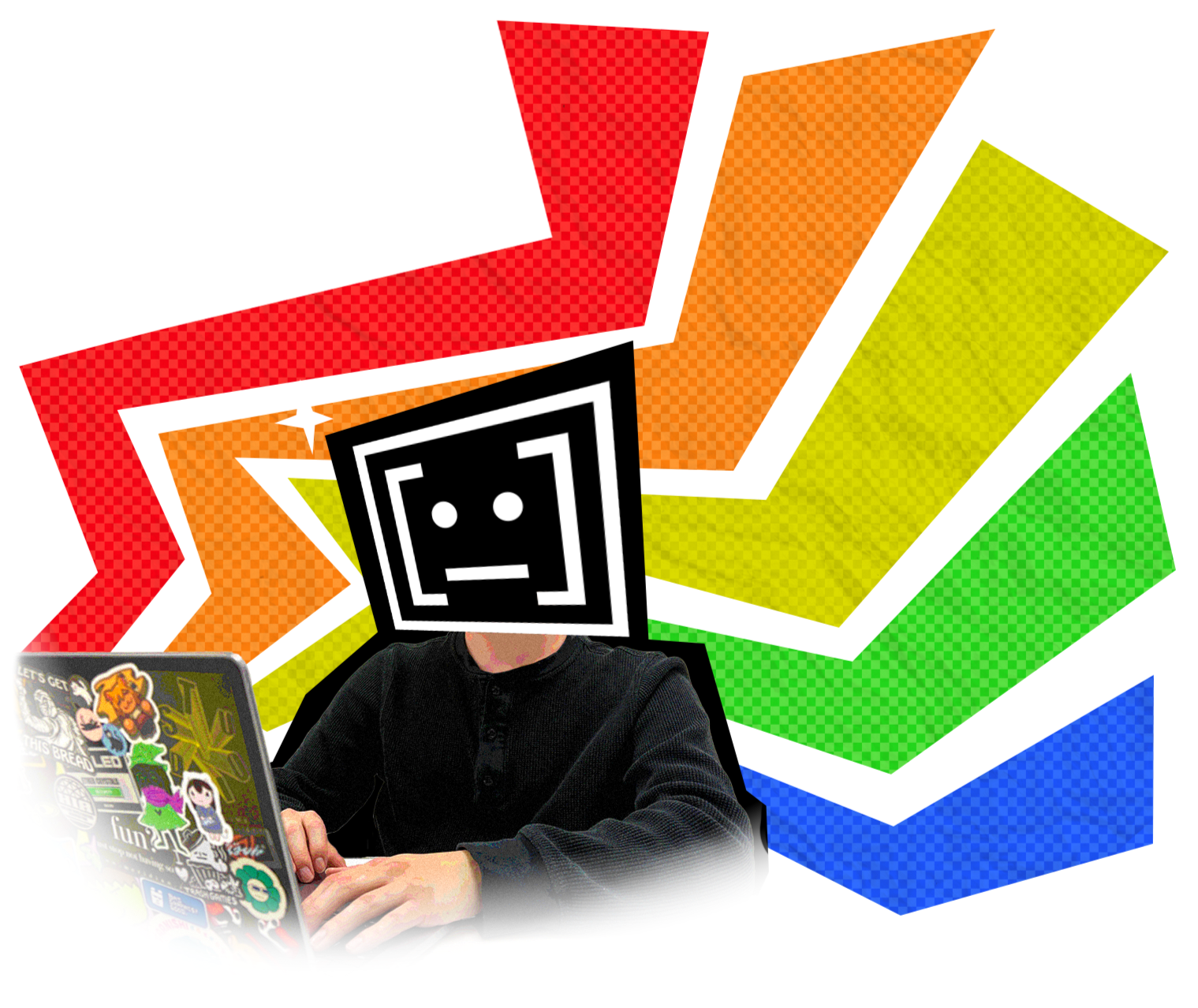
Hi, I'm Eldin
I'm an illustrator who wants to bring a little bit of oddity into the world through my work.
Scroll down! Or press the button, I'm not your boss.
↓ View Featured Projects ↓

oyster bay resorts

function coffee

voice, expression, and the type

illustrations


Like what I make? I have more.
View the other design works I couldn't fit on the home page
Designer
Illustrator
...Whatever this is
I just like making things
Maybe I can make something for you.
Remember that button
at the start?
Well guess what? I put it down here just for you. No problem.
Uhhh...
The button was up there, you can stop scrolling now.
You know what,
Fine, hold on.
The other design works I couldn't fit on the home page
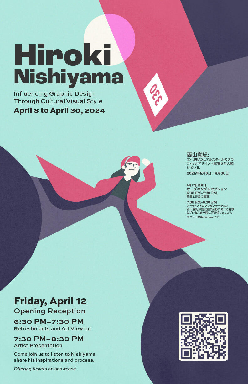
Hiroki Nishiyama: Graphic Designer Excellence Poster
This project pressed me with the challenge of taking inspiration from an existing style—that of Hiroki Nishiyama's—for an event poster. This project let me express the style and feel of Nishiyama's artwork through hierarchy of type, limited selections in color, and key placements of subjects.
Key Strategies
Typography
Illustration
Color
Advertisement
Layout
Design Process
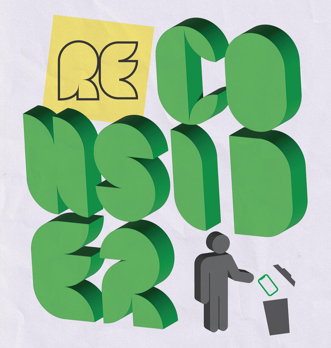
RECONSIDER
A portion of a larger project that really stuck out to me in when developing it. This design was created with the intent to raise awareness towards e-waste, and how often it goes unnoticed when tech is tossed away. The Eco-feel of the design was brought to life with the use of a green, leaf-like custom type and paper texture.
Key Strategies
Typography
3D Objects
Texture
Environmentalism
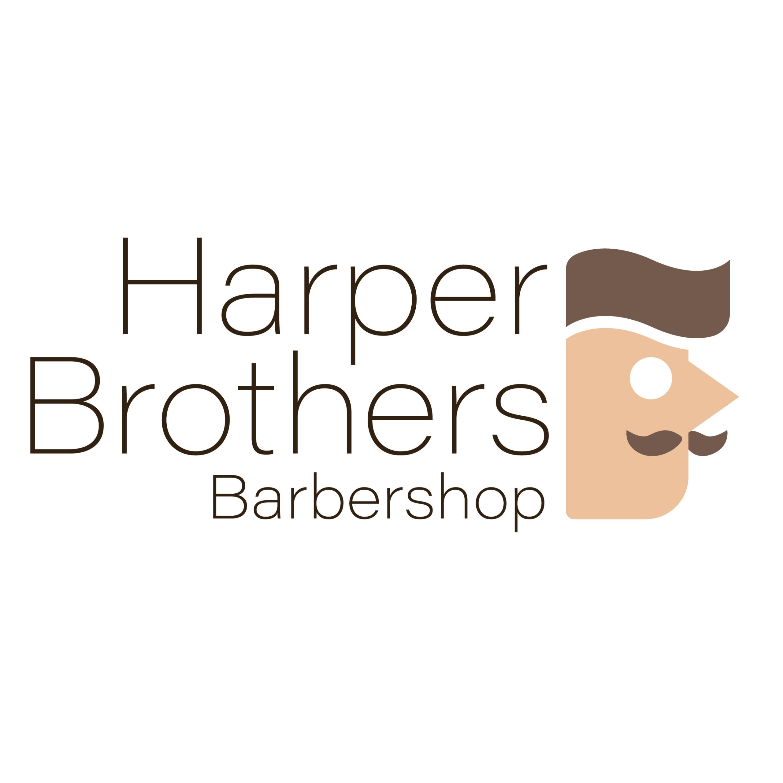
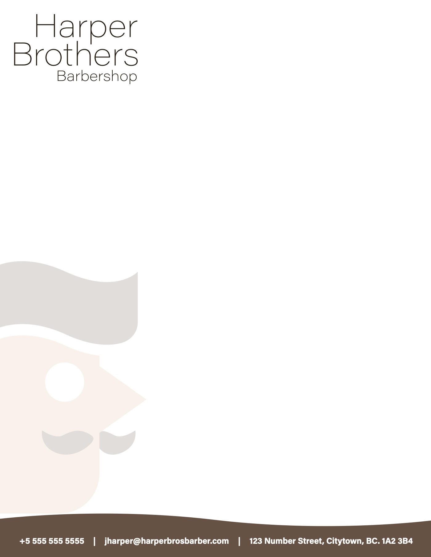
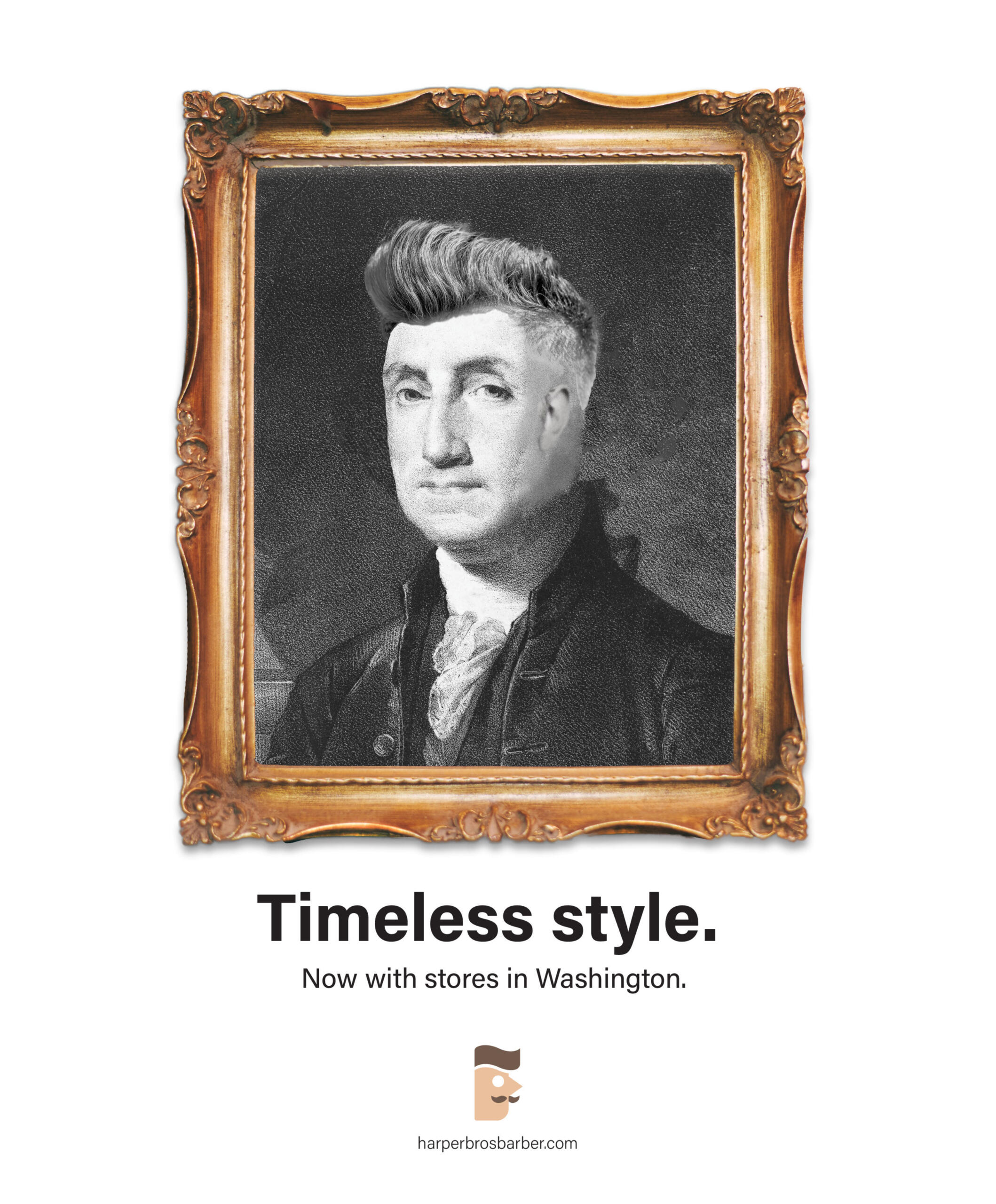
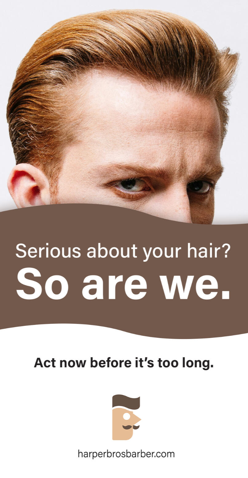
Harper Brothers Barbershop
You know what makes the difference between a good barber and a great barber? Great barbers are ever so slightly funnier. The Harper Brothers are a humorous duo, and I wanted to express that through their identity and marketing. Their simple logo creates a recognizable and memorable figure, while their advertising humors to an all-encompassing audience.
Key Strategies
Logo Design
Wordmark
Advertising
Personality/Identity
Marketing
Photo Editing
Stationary Design
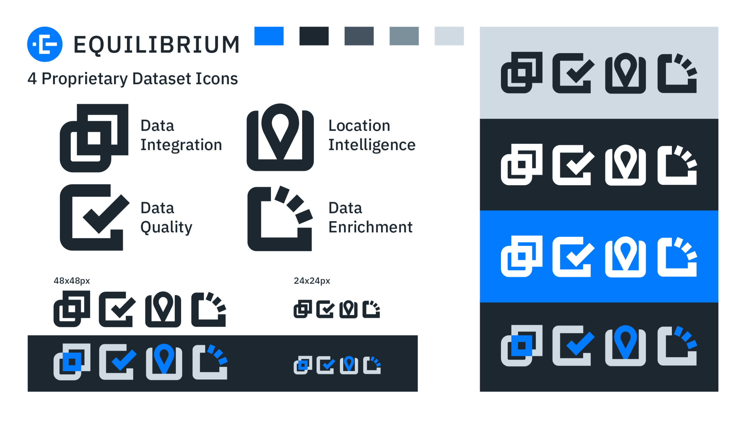
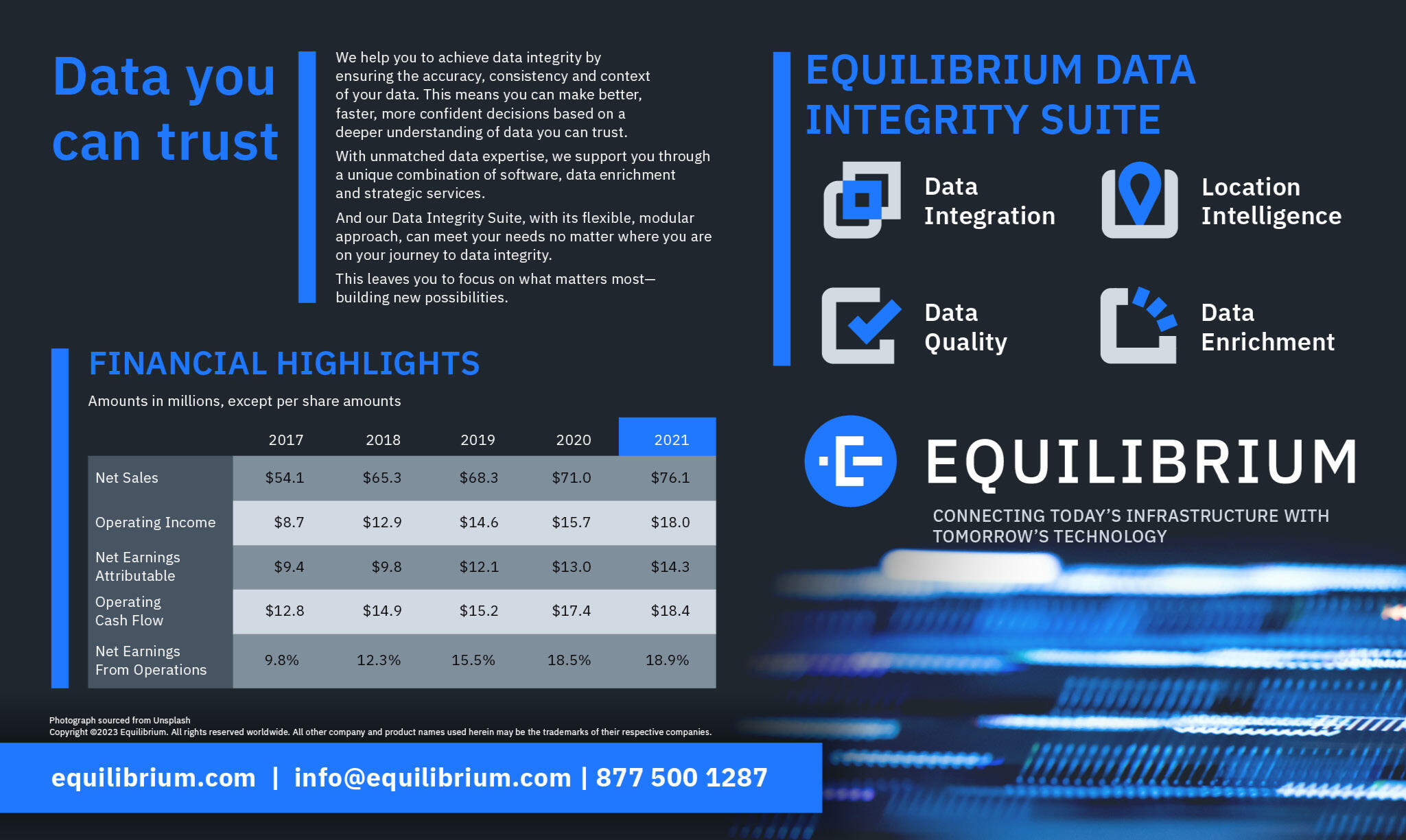
Equilibrium: Dataset Icons and Table Set
Equilibrium is a sleek and solid data branch, it was vital that the icons reflected this identity and were able to be scaled and visible at smaller sizes. This project challenged me in organizing promotional material and organizing datasets for visual consumption.
Key Strategies
Typography
Iconography
Color
Table sets
Promotion
Uhm... Hi!
What's up? I'm Sage!
I'm a half-Canadian, half-Japanese nerd who loves to eat nattō, play video games, and doodle all over my sketchbooks.I specialize in vector illustration, but I am also experienced in brand identity, package design, motion graphics, and typography! But for me, illustration is where its at.When I was a kid, I grew up surfin' the early internet, which introduced me to the countless people, places, and experiences that continue to influence me to this day.Since 2019, I've taken upon the name Eldin, fusing together my love for art and my passion for design as part of my ongoing career, both in the real world and on the ever-changing internet.Thanks for stopping by :)

Socials: Bluesky
Backed By Academics
With a fourth year standing in my Bachelors in Design, I am constantly expanding my knowledge of Graphic Design. Applying my learned subjects into personal works and professional practices.
Always Experimenting
I'm always learning both modern practices and traditional practices, all while pushing to see whats new and pulling inspiration from countless sources across the web—looks like being on the internet 24/7 has its perks. Take that, thoughtful family members.
Flexible Skillset
I love to learn new software and programs frequently. Constant exposure to how user interface and design is implemented in my everyday items helps me adapt to new situations on the fly.
Software Knowledge
What is a handyman without his tools? Probably a guy that can give some pretty good advice, if anything.
Adobe Creative Cloud Suite
Illustrator
Photoshop
Indesign
Premiere Pro
After Effects
Lightroom Classic
Other Software (PC/Mac/Browser)
Apple Keynote
FireAlpaca
PhCode/Brackets
Wallpaper Engine
Canva
Figma
Specialties and Expertise
Illustration
Print Work
Web Design
Motion Graphics
Document Layouts
Funny (Ask my friends)
CONTACT
Questions? Comments? Etc? Right here.
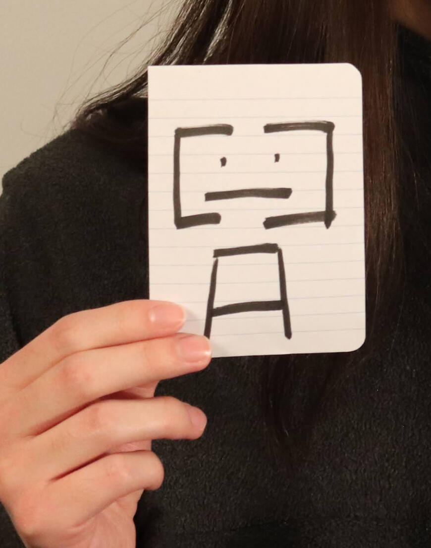
Illustrations

Bad Cough | Illustrator

DragonClaude | Illustrator + After Effects

Jax | Illustrator + Photoshop | Fanart

Go Strike! | Illustrator | Fanart

The Creaking | Illustrator | Fanart

MNSTRCT | Illustrator | Fanart

Beyond Genre | Illustrator

Best Friend | Illustrator

DanDaDan | Illustrator | Fanart

Commander | Illustrator

MAGIC SH*T | Photoshop

7th Sanctum | Photoshop | Fanart

'scuse me | Illustrator

Beyond the Artboard | Illustrator

Logo Experiment | Illustrator

Untitled | Illustrator

Self-Aware | Illustrator


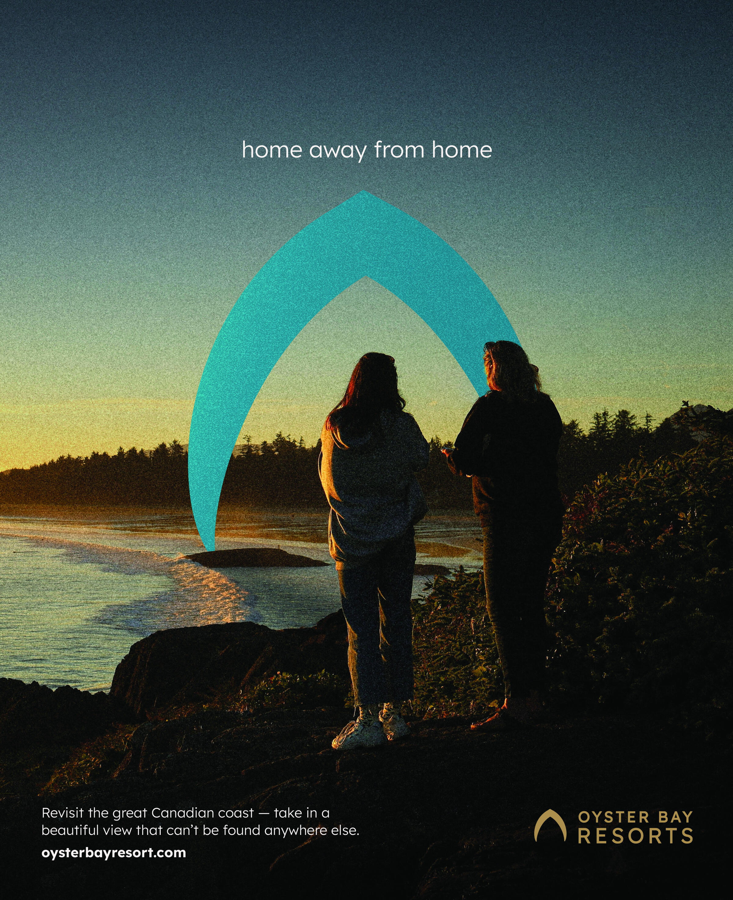
Bringing a Fresh Identity to a Local Waterfront Chalet
Oyster Bay Resorts is a waterfront resort advertising a luxurious getaway for families and partners.Their brand refresh would need to hone in on highlighting their key identities that differentiate themselves from competitors.

A front view of the main office

Their current logo

The chalets, all images courtesy of Oyster Bay Resorts

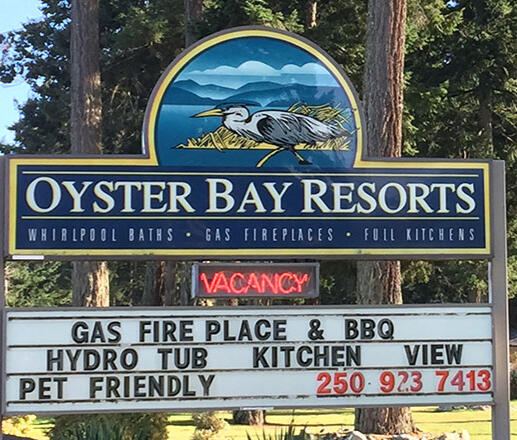
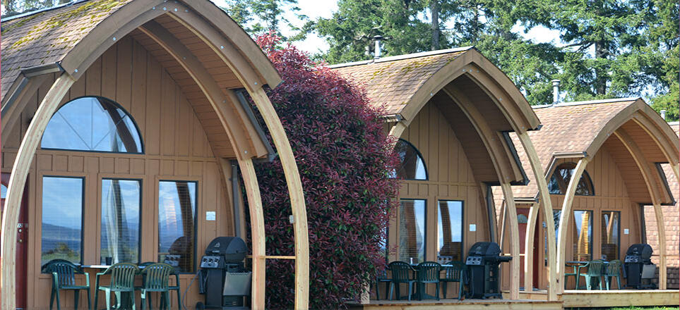
Oyster Bay Resorts’ most recognizable features are:1. Their half heart-shaped chalets2. Their proximity to the oceanI incorporated both of these aspects into their refreshed identity. Their new logo would give them a more luxurious, minimal look, all while considering the oceanic style of their identity across their products, apparel, and utilities.Work completed: Typography, brand identity, layout, promotional material, mockup design.


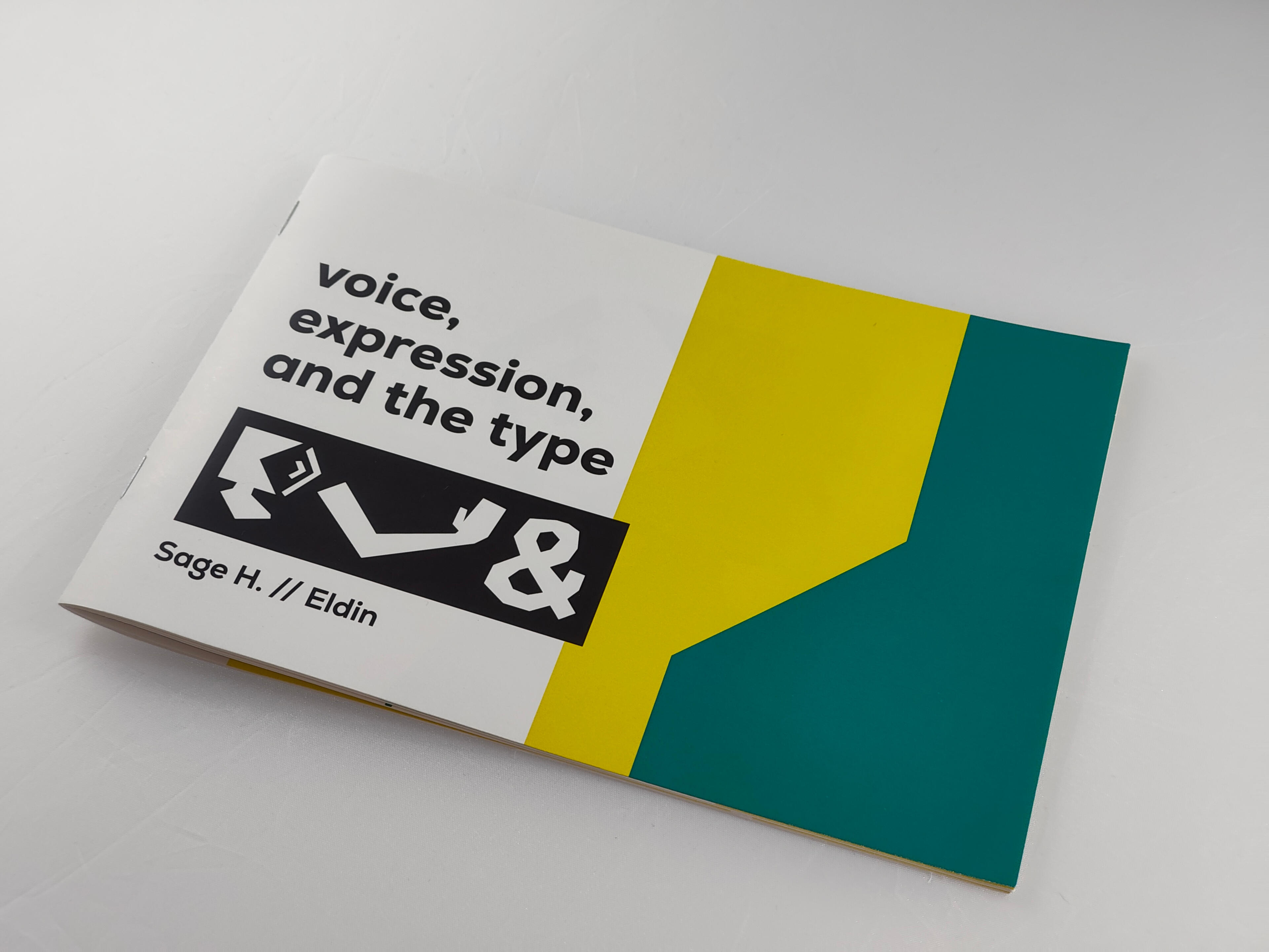
Voice, Expression, and the Type (Booklet)
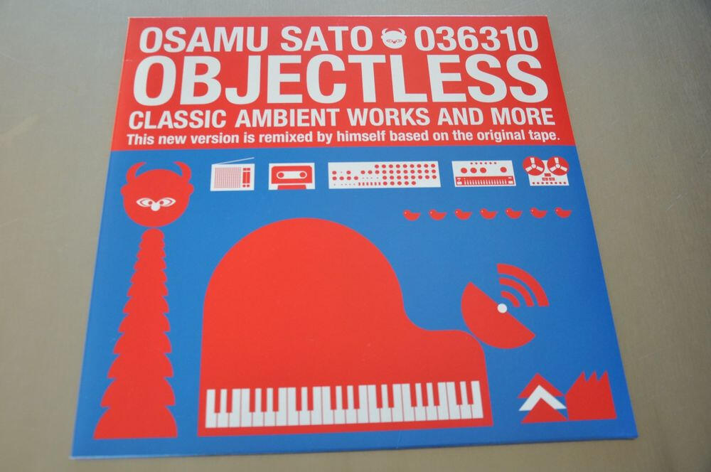
Voice, Expression, and the Type, is a typography booklet independently written and designed by me. This book was designed with the purpose to portray how typography connects with the way we speak to others and express ourselves.I was inspired by various artists whom I’ve followed for quite a bit, those being Osamu Sato, P1PE, and Odermatt & Tissi, I directed the style of this book to follow loosely in a similar style to all of these creators.

Osamu Sato's book OBJECTLESS
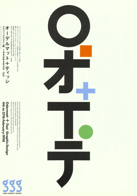
Odermatt and Tissi
The booklet features overlapping elements to signify the overlap of typography with expression, and the round typography and rough-cut illustrations directly contrast each other, creating visual distinction. The whole book overviews many type principles in visually striking ways, all while bringing home the importance of type and what a skilled hand can bring to it.Work completed: Typography, promotional materials, preparing files for print, illustration, writing.


Bonus: Promotional comic for Instagram


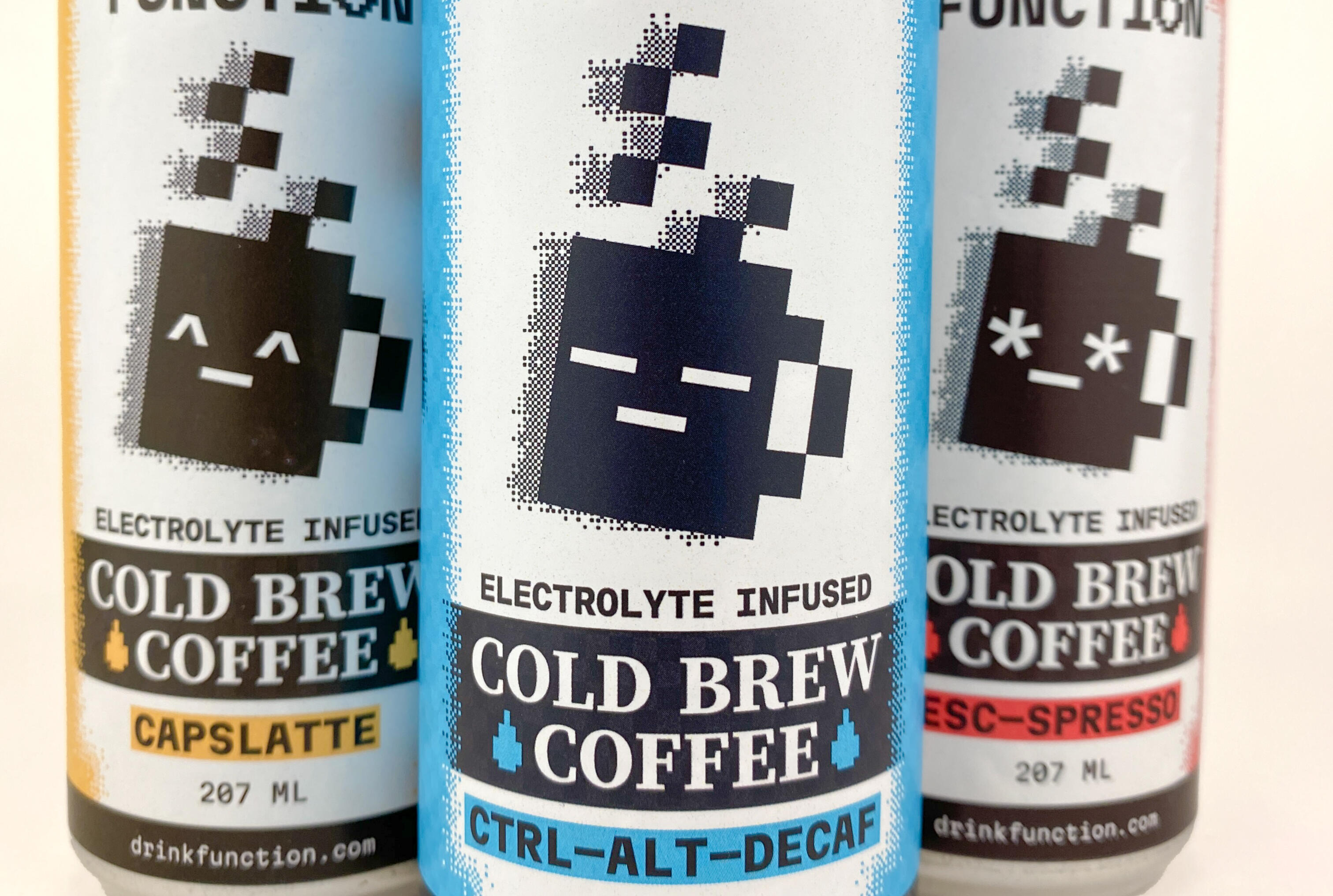
FUNCTION: Building a drink for smart work
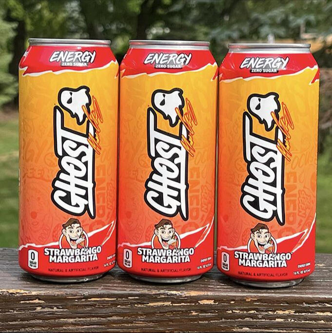
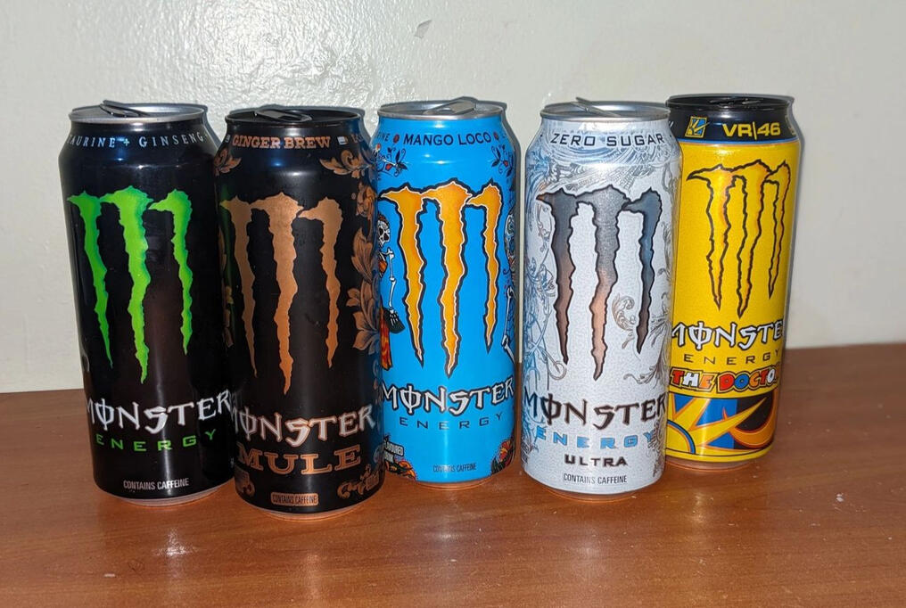
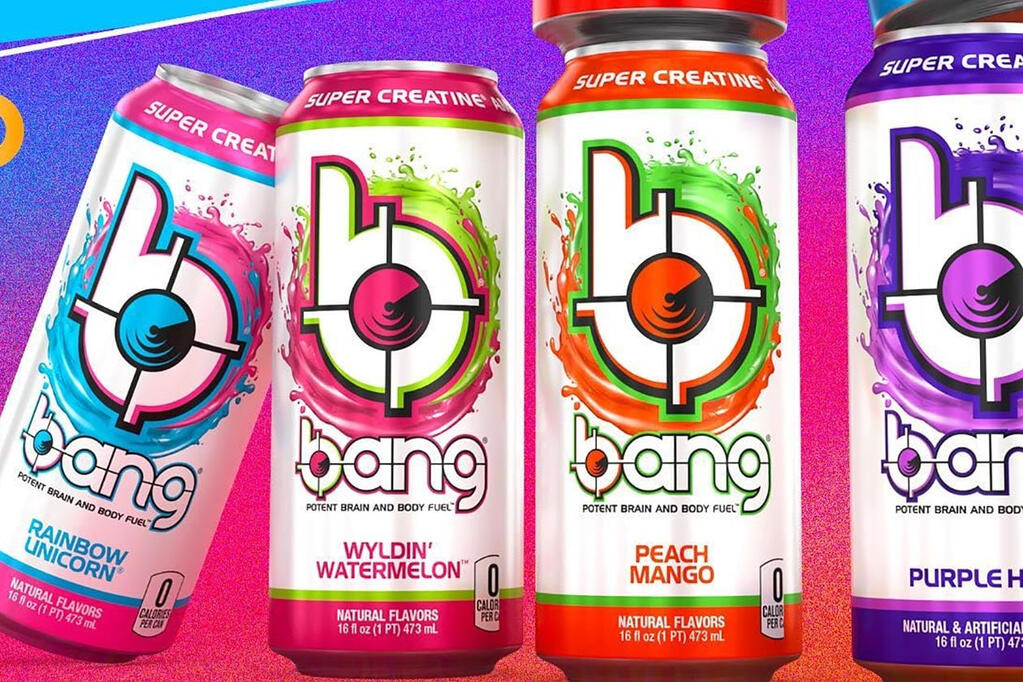
FUNCTION is a tech-inspired, gamified cold-brew coffee drink. Their new package design is intentionally designed to break the mould of other energy and/or gaming-inspired drinks seen on market shelves.Most tech-inspired caffeinated drinks approached their packaging style with an electric, yet overwhelming energy—designs that depicted the drinks as more hyper than productive.

Ghost Energy

Monster Energy

Bang Energy
Creating a design with a more productive look meant diverting from this convention towards something calm, yet focused, direct, and containing similar elements that consumers can connect back to video games, gaming, and technology.

An idea (that didn't work)

Progress photo using Mac windows as inspiration

Illustration concept (Now we're getting somewhere!)
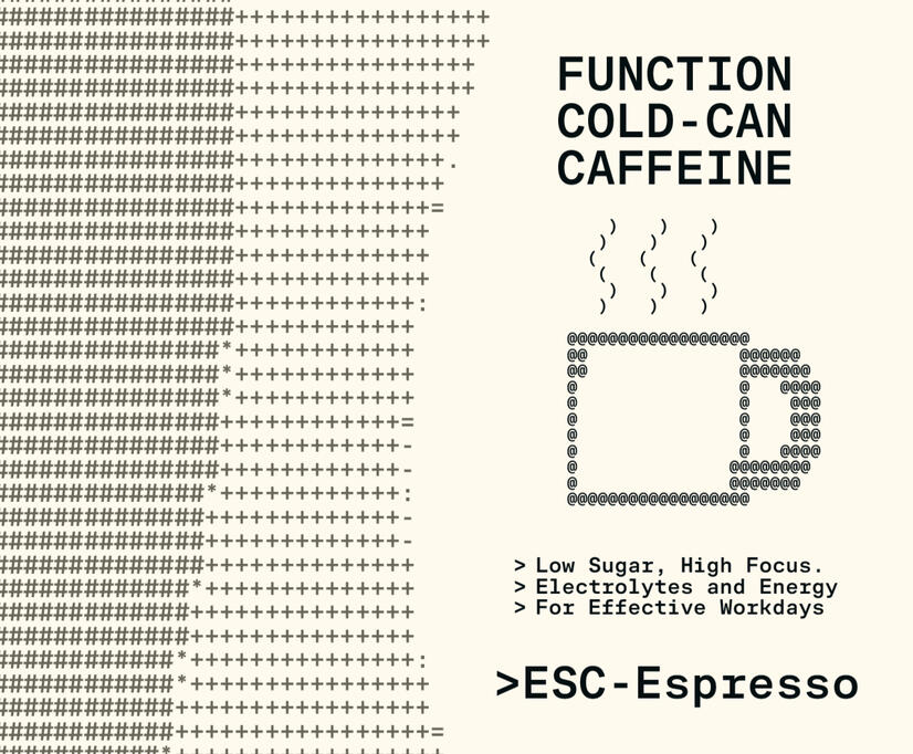
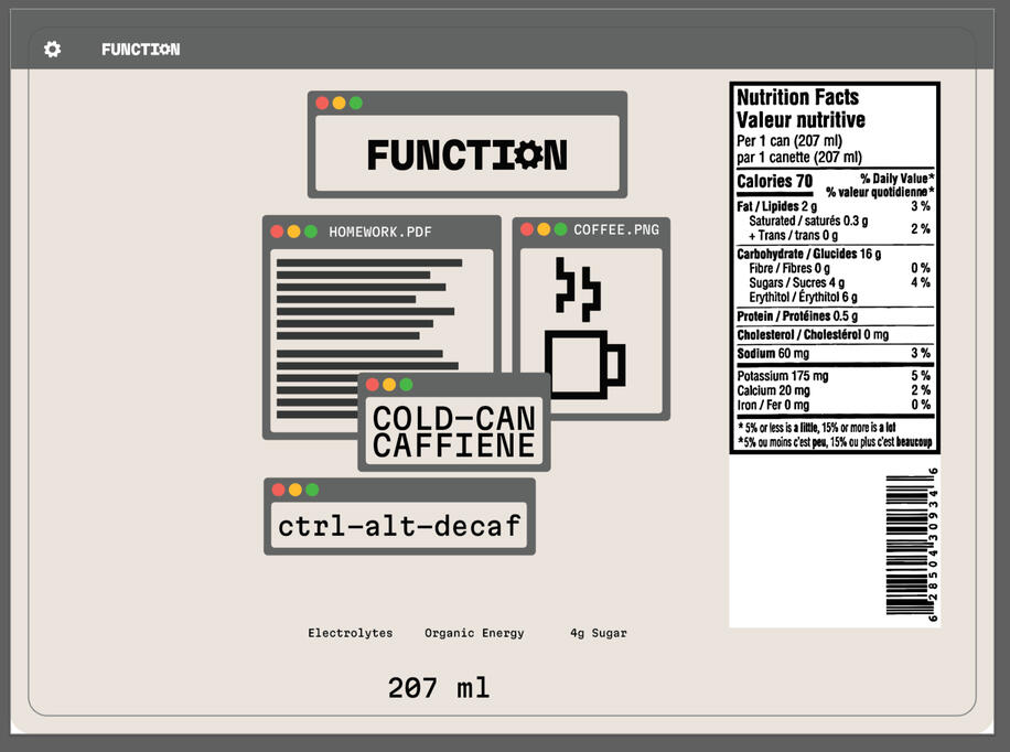
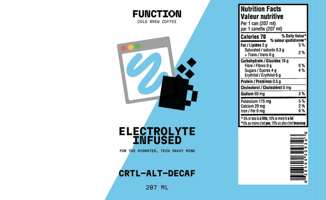
The main package designs feature heavily stylized pixel-art across three different flavors, each one depicted with a different color and nerd-oriented title. The design focuses on being colorful, retro, and focused, without exuding an overwhelming sense of energy present in other present energy drink brands.Work completed: Packaging, brand identity, competitor study, print production/communications, illustration.


FRAME 26: Hoodie, Site, and Screen Assets
FRAME 26 is the annual showcase of VIU’s graphic design graduates of 2026 (that's me)! The logo and identity has been loosely defined, but both will need to be further emphasized in its apparel and visual presentations.The promotional designs and presentation are a visual interpretation of how our class flourishes in framing our ideas and thinking outside the box — perhaps, how we think outside the frame.
FRAME26 Logo, courtesy of Stefan Emmanuel
The accompanying assets were designed to connect with the experiences of the graduating designers’ approaches, ideas, and collaborative nature. This meant depicting visuals of the literal tools we used, mantras we would earnestly (or jokingly), repeat to ourselves, and visualizing the event’s identity in various, unique forms, inspired by the students who I’ve worked alongside for the entire program.Work completed: Templates for event monitors, layout, promotional material, apparel design, website design and layout (built with Carrd), visual identity.


Title
Fugit aliquam dolorum adipisci atque. Sit sed natus doloremque placeat temporibus. Id dolorem facilis quia consequatur velitEt distinctio autem qui. Et accusantium impedit aut esse earum eligendi. In qui non accusantium ratione. Fugit aliquam dolorum adipisci atque.
Supplementary caption (required)

aaaaaa
Et distinctio autem qui. Et accusantium impedit aut esse earum eligendi. In qui non accusantium ratione. Fugit aliquam dolorum adipisci atque. Sit sed natus doloremque placeat temporibus.Pulvinar vivamus fringilla lacus nec metus bibendum egestas. Iaculis massa nisl malesuada lacinia integer nunc posuere.Work completed: Lorem ipsum dolor sit amet.


